Is Responsive Design Worth It?
Having spent quite a bit of time converting this site to a Responsive Design I then thought I'd look at visitor stats to see how many of you are mobile.
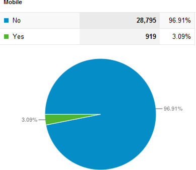
Turns out it's surprisingly few of you. As little as 3% of you use mobile devices!

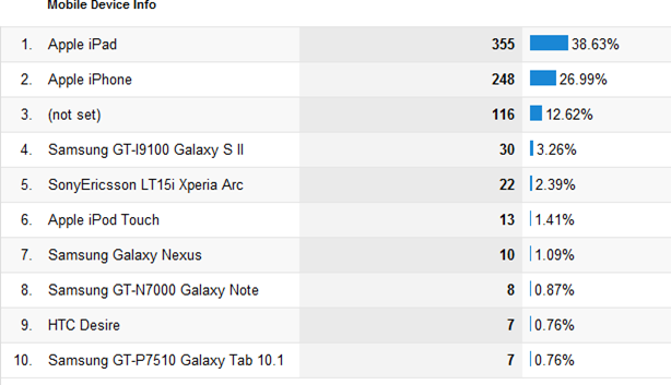
This breaks down further, by device type, as follows:

So, a third of those of you using mobile devices are using an iPad, which kind of worked ok before I converted to responsive CSS. All my work was to cater to 2% of my readers. Doh.
Would I have bothered converting this site had I done it the right way round and check the above stats first? Possibly not, so I'm glad I didn't check, as I'm glad I did the exercise. Not only as to learn more about it but also to spread the word. Which, after all, is what having a techy blog is all about, right?
Also, remember that Responsive Design is not just about mobiles! It's also about varying screensizes across all device types. Netbooks, laptops, TVs, 27" iMacs. The whole gamut.
It was interesting to see results from Wednesday's survey on interest in Responsive Design. Only 6% of you have no interest. I'd have thought that would have been higher.
Based on the interest in it I'll talk about it a little more next week. Probably just a more in-depth how-to and then I'll stop talking about it.
I'll leave you with some other great examples to ponder:
If you're still not convinced...
I'm more than just one in 3%, I'm one billion!!!
Thanks Jake, look forward to it.
Reply
I usually read your site through Google Reader with my iPad or old Palm Pre so your stats may not be giving you the whole picture if others like me read your blog with an RSS reader.
I enjoyed the information quite a lot. A good thing to add right now would be HTML5 attributes to your comment form. That way at the very least the email keyboard will appear for the email field and the URL keyboard for the web site field.
Good work so far.
Reply
Same here regarding Google Reader, but posting comments is a pleasure now from a mobile device
Reply
Yes, Google Reader lets me know when you've posted. Then I pop over if I want to comment or read all the comments, even though I subscribe to the comment feed also. (Out of 150 blogs I follow yours is the only one I follow the comments too.)
I think it's too soon to judge if your responsive redesign is helpful. Now you know the percentage that read via mobile. Wait a year and see how that percentage has changed.
Reply
Jake,
I guess your readers (me included) would read your blog even when it would look like a 3270 session. So looking at "worth it" from this single side misses the point.
You acquired an important skill that will make the work you do for your clients better *and* you shared that with a wide audience. So every minute is well spent.
Reply
I do not believe that the numbers are appropriate to consider that the effort was not worth it. First the majority of the visitors will be developers. Most of us would be accessing your site using our desktop or supped up laptops since most likely we would be developing, testing, or debugging something.
Second, responsive web design is focused on providing content in the context of what the user needs. So if I am in the situation that I need to reference your web site and I only have a phone with me, having the site utilize responsive design makes my life easier to read and digest. I hate going to a web site in which I can not read because I need to expand it.
This is my 2 cents.
Reply
Considering the alternatives, like building an app or building a separate mobile website, I would think this is a rather excellent solution. It's a skill all web developers have to at least consider using on new projects.
And even on the iPad, the new design is a big win in portret mode.
As a side note: I used your site to demonstrate and impress a client of mine that responsive design is the way to go. So thank you for that!
Reply
It could indeed be that your stats are not right due to RSS. And you could also look at your stats differently: is the % so low because there is no interest, or is it because your site was best experienced on a desktop? I don't think the latter is the case, but cause and effect can go both ways in this case.
Also take into account your users. A tech blog is not something many urgently require on-the-go. It's typically something you read at leasure, when time allows, often on bigger screens.
Still, as your site is heavy on text, a few quick fixes is all it takes to make it suitable and pleasurable for various devices. And you learned a great new skill. Win win.
Essentially what you did is graceful degradation. You started out at desktop, and provided optimized layouts (fixes) for smaller screens and less capable devices. According to many in the web industry, this model is about to be turned upside down into mobile-first. Mobile will be the most important channel. You start out with a mobile design, and then enrich it for larger screens.
Reply
It's easy: Until now only 3% of us have been accessing your site using mobile devices, because it did NOT implement responsive design, yet. From now on, numbers will be sky-rocketing ... ;-)
Reply
In terms of future proofing and updating the look of your sight in one fell swoop, I say "worth it".
Reply