Adding a Little HTML5 and CSS3 to CodeStore
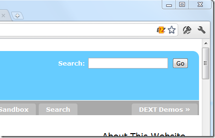
For the last seven years the site-wide search field on this site has looked like this:

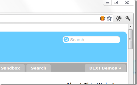
This week - in a moment of boredom - I decided to spruce it up a little and now it should look like this:

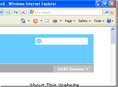
Whether it looks like that for you or not depends on the browser you're using. If you're using a modern and capable browser it should. If not you might see something like this:

Either way it should still be obvious what it is without the field label or the "Go" button?
How'd I Do That?
Simple. First I changed the HTML markup to use a little HTML5:
<form method="post" action="search?CreateDocument">
        <input type="search" placeholder="Search" name="Query">
</form>
I've highlighted the key parts. Adding the placeholder attribute is what puts the "Search" text inside the field and removes it when clicked on (no JavaScript required!). That's a new HTML feature and you can use it on any input field.
Then I added some CSS3:
input[type="search"] {
        padding: 4px 6px 4px 23px;
        border-radius: 10px;
        background: white url(images/icons/search.png) no-repeat 2px 50%;
        -webkit-appearance: none;
        border: 0;
        -webkit-box-shadow: inset 0 1px 2px rgba(0, 0, 0, 0.4);
        -moz-box-shadow: inset 0 1px 2px rgba(0, 0, 0, 0.4);
        box-shadow: inset 0 1px 2px rgba(0, 0, 0, 0.4);
}

input[type="search"]:focus{
	outline: none;
}
The last rule in the code above is to stop the field getting and orangey outline when the user clicks inside it.
And that's all there was to it really. Next time you add a search field to a form why not consider using a similar approach?
Great work Jake, love it. I think, by the nature of the visitors you get here, most will be on 'capable' browsers, no?
I'm trying to find the time to learn about HTML5 but have not come to the new form bits yet - that placeholder attribute is well overdue, only yesterday I added some javascript to do the same on an app...just need more people to drop IE 6/7/8!
Reply
You'd think most would be but, at the same time I added the above HTML5 I made the following changes:
Changed:
<div id="header"></div>
and
<div id="footer"></div>
To:
<header></header>
<footer></footer>
Shortly after I got an email from an IE8 user telling me it looked odd, so I reverted that part back. Will try and work out why it didn't work later (it should be ok in theory) but I think it will be a while before I - or any site owner - can assume everybody has a capable browser.
Reply
Show the rest of this thread
Looking at Analytics for this site: 30% of users are on IE and 80% of those are on IE8 or lower! 5% are still using IE6!! Only 20% are using IE9.
Reply
Show the rest of this thread
Jake, your main menu needs fixing (its become a list - in Chrome anyway).
Reply
Probably your cache of the CSS file. I changed the version number in its file name. Try again now.
Reply
Show the rest of this thread
Cool change, thanks for sharing.
Reply
I see just a plain text field on ie7. no search icon on the left of the text box.
Reply
Jake,
I've just copied your idea in my blog. It's just a detail but improves the place. I've also seen the problem Don is saying regarding IE7 ( can't see the icon ) but the search works all right.
Thanks for sharing once more,
Reply
Hmm, odd about IE7. Could be that input doesn't support bground image in IE7. Can't be bothered to spend time on dealing with old browsers though...
Reply
Nice. I also like the way it is done on apple.com. It expands automatically once cursor is place in the search field.
Reply
Where did you specify the doctype? Did you use the $$HTMLFrontMatter field?
Reply
Yes.
Reply