Adding The Edge To Your Button Images
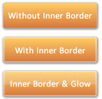
Which one of these buttons looks best? More button-like if you will?

Obviously "better" is a subjective term but most would agree it's the bottom-most one?
Until now, whenever I've created my own buttons using Fireworks (as described here) I've always just used a flat button, like the topmost one of the three above.
Then I saw these "glossy" buttons on Fireworkslabs.com and got curious how they got them looking so buttoney:

To work this out I download the (editable) PNG file from their site and picked the button apart, as you can see below:

All it takes to make a normal gradient-filled rounded-rectangle look like a glossy button is to add a 1px white inner border and a half-sized semi-transparent rectangle over the top of it.
I made that sound a bit easier than it is, but it's not much harder than it sounds. If I could be bothered I'd take screenshots of the whole process, but that would takes ages and I'm sure you can work it out for yourselves.
So there you go -- add some edginess to your buttons from now on. I know I will.
Cool. I'll have to try that. Thanks for sharing it.
Reply
Me too, I like it!
Reply
All my navigator buttons are dynamically generated from the Domino database. Can these be generated dynamically?
Reply
Generated? How so?
Reply
Show the rest of this thread
Hi Jake, have you seen these CSS3 generated buttons:
http://www.red-team-design.com/just-another-awesome-css3-buttons
It's impressive what you can do with CSS3 - and thereby avoid the use of button images.
Reply
Hadn't seen those buttons (thanks) but am semi-aware of what CSS3 is capable of look forward to the day (in 2 or 3 years?) when it can be used widely in confidence.
Reply
.lotusBtn I would say or even .lotusBtn .lotusSpecial
http://www-12.lotus.com/ldd/doc/oneuidoc/docpublic/components/buttons.htm
Reply
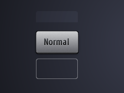
Great article Jake, reminds me to the time I was doing embossed/indended lines etc. with a thin white and light gray line near to each other on a dark page background ;-)
Reply