Mobile: A New Unit of Measurement
If you get in to mobile development, in particular with Android, one of things you need to get used to is the variety of screen sizes out there. Not only the size of the screen, but - more importantly - the DPI or Dots Per Inch (aka "density").
If you define screen layout and font sizes in terms of exact pixels then it will look ok on one screen but not scale up or down to others with larger or smaller screens, respectively.
In steps the unit of measurement known as Density-independent Pixel (aka "dp" or "dip"). Where 1px = 1dp * (dpi / 160). So 1 dp is the same as 1.5 px on a 240 dpi screen and 0.75px on a 120 dpi screen.
In Android you can then do this:
<TextView android:text="Large Text" android:textSize="35dip" />
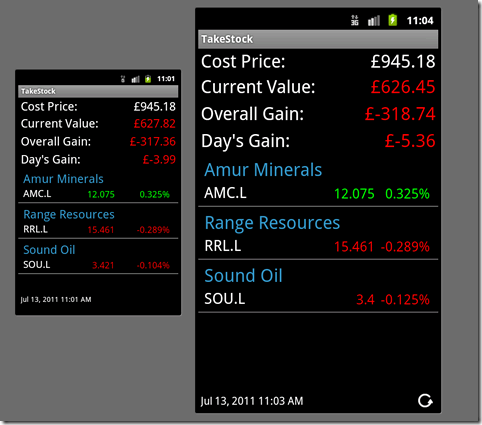
You then know it will appear a consistent size across all displays. Here's an example of one app running on a HTC Hero-sized phone and on a Galaxy S2-sized phone. Notice how they scale.

The whole screen size issue with Android takes a bit of getting the old head round, but if you're going to get in to Android development you can't avoid it and need to fully read and understand this guide.
Different but refreshing. It's the way it ought to be, really, in my mind. If I'm developing a UI with a lot of deliberation, I don't want something random like device resolution spoiling it. Thanks for sharing the info! I haven't had a chance to do real native phone dev yet. Still doing web for Blackberry.
Reply