Dot-Style Photo Navigation Re-Visited
Last week's post about Karen not "getting" my app design was a bit of an eye-opener. I knew I had it wrong with. Just not how wrong. Turns out almost all of you thought, like Karen, that the dot-like navigation system was in fact a star rating.
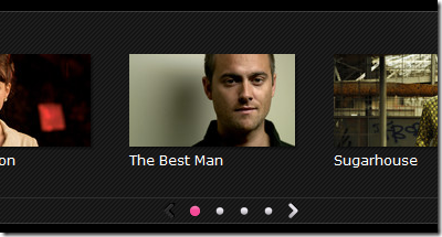
Since then I noticed on BBC's iPlayer they use a similar UI pattern but that they include arrows to each side.

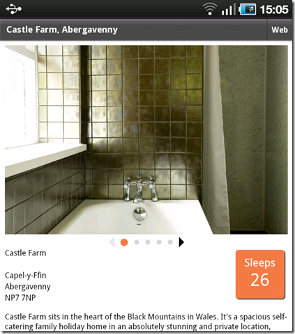
The use of arrows was suggested by a couple of you guys last week too, so I took a stab at it.
Here's the same app again:

Hopefully this time it make a little more sense?
While this app is nothing more than a way of me messing about with learning mobile development it's been an interesting exercise and just goes to show how it important it is to test your designs on real users.
If it were likely the app would leave these four walls then I'd probably re-think the use of this UI completely.
Much better with the arrows. Not everyone has an iPhone yet.
Reply
No need to look at the BBC website. Just read your own comments where
Jerry Carter
Posted on Fri 13 May 2011 07:57 AM
Two remedies come to mind.
First (easiest) add a left and right arrow or triangle to either side of the dots that can be used for "next" and "previous"[...]
Reply
Jerry was one of the people I referred to above. It was there comments that made me think of it and then the BBC site just confirmed it as a good idea.
Reply
Maybe it would look less like a rating if it were at the bottom of the screen instead of right below the picture. The arrows do help though.
Reply
But it needs to be as close to the photo as possible as that's what it relates to, surely?
Reply
Show the rest of this thread
My first thoughts were that it was the same as the iplayer website, with which I am very familiar! One of the web rules of course is to follow standards because people are familiar with things and don't have to think "What does that do?". Not suggesting iplayer is industry standard, but it's something I'm very familiar with and took that knowledge of functionality to your app.
Reply
That improves it. Good to see the idea validated elsewhere. My only niggle with this rendition is the 'grayed-out' arrow is a touch too light. I had to adjust the angle of my laptop monitor to see it. BBC version uses pattern + contrast to show it, which, while better, is also a bit too close on contrast with the background to be easy to see. I wouldn't bother pointing it out but for that we're firmly pursuing usability here.
But, for me at least, this more readily looks like navigation and less like a possible rating system.
Reply
Correction - contrast visibility = accessibility as much as usability.
Reply
It's quite amazing what a small difference a couple of small images can make.
A reminder that when it comes to usability: test, test, test. And don't become too attached to a fantastic new feature if it just doesn't work for your users - although for me the first demo was quite obvious as I have an iPhone, and this version even more so.
Reply