Apple-Style Dot-Based Scroll Indicators in Flex
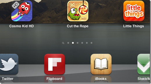
What do you call those rows of dots you see on tablet-based apps nowadays? The ones that let you know your looking at number 2 of 6 of something. Like these:

If you've not used an iPad and can't work out what they mean, then it simply says you're looking at screen 2 of 6. There's a screen of icons to the left and four more to the right. As you swipe between each screen/desktop the white dot moves along with you.
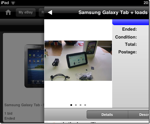
It's a brilliantly simple little indicator that works really well. So well that they're appearing in other places too, such as the eBay iPad app:

In the shot above I'm looking at photo 1 of 4 for the item listed. Swiping the photo left and right navigates between them.
But what are they referred to by designers? Horizontal dot-based scrollbars?
I only ask what they're called because yesterday I decided to create a Flex version in a mobile app and didn't know what to call my component. In the end I stumped for "Dots.as".
Implementing in Flex
I've always maintained that just about anything is not only possible in Flex, but also relatively simple. Implementing these dots was a doddle and reminded my why I love Flex (on a good day).
The app I'm working on is to accompany my group accommodation website. It's just a play thing at the moment to let me learn mobile dev with Flex.
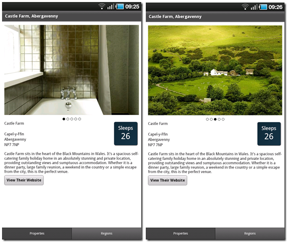
I want to be able to show a holiday property and let the user view all the photos. Here's what I ended up with:

In the grabs above you can see (hopefully) that there are 5 photos. In the shot on the left, we're looking at the first. On the right it's the third one.
How did I do this? Simple. I created an ActionScript component called dots.as, which looks like this:
package components
{
    import mx.graphics.SolidColor;
    import mx.graphics.SolidColorStroke;

    import spark.components.HGroup;
    import spark.primitives.Ellipse;

    public class Dots extends HGroup
    {
        private var _count:Number;
        private var _current:Number;
        private var _dotSize:Number = 8;
        private var _dotColor:uint = 0x000000;

        public function Dots()
        {
            super();
            horizontalAlign="center";
        }

        private function addChildren():void{
            var ellipse:Ellipse;

            this.removeAllElements();

            for (var i:int=0; i<_count; i++){
                ellipse = new Ellipse();
                ellipse.width = tmp.height = _dotSize;
                ellipse.stroke = new SolidColorStroke(_dotColor);

                if (_current==(i+1)){
                    ellipse.fill = new SolidColor(_dotColor);
                }
                addElement(ellipse);
            }
        }

        public function set count(value:Number):void{
            _count = value;
            addChildren();
        }

        public function set current(value:Number):void{
            _current = value;
            addChildren();
        }

        public function set dotColor(color:uint):void{
            _dotColor = color;
        }

        public function set dotSize(size:int):void{
            _dotSize = size;
        }
    }
}
As you can see it doesn't use images. It just uses primitive shapes to draw the circles. Each time you change the current index of the photo it "redraws" them all.
You can use it like this:
<components:Dots
        width="100%"
        height="12"
        dotSize="10"
        dotColor="0x666666"
        current="{_currentPhotosIndex}"
        count="{photos.length()}" />
In this case I've bound the current index to a variable on the page being viewed. Whenever it changes, the dots get updated.
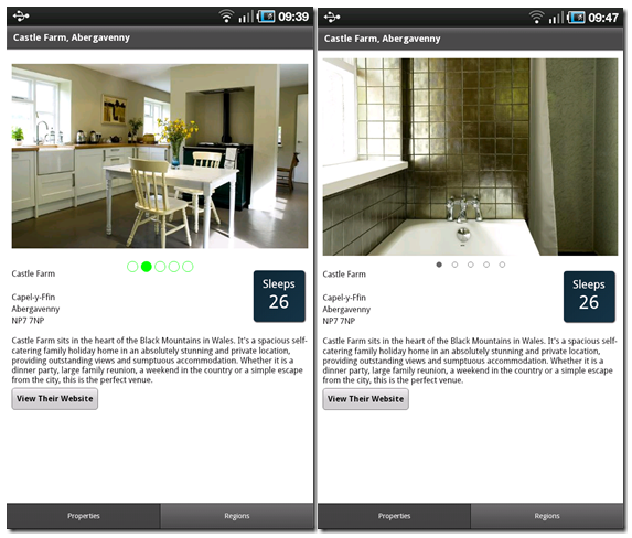
Using the custom colour and size properties you can spice things up a little, like the image below left. Also, because the Dots component is based on Spark's HGroup component then you can also use the "gap" property to add more spacing, as in the image below right.

Simple, but effective and easily re-usable. My favourite kind of component.
What About The Swiping?
As part of this exercise I needed to work out how to let users of mobile devices swipe the image. Turns out this too is really easy. You just need the image to listen for the gestureSwipe event.
I'd show you a video of it on the device if it were easier than it is. Suffice to say it's not quite as elegant as I'd like it to be. The swiping isn't tactile. You swipe and the image just changes. What I'd like it to do is scroll images left and right to give a sense of what's happening. If I get chance I'll add that to a later demo.
Don't know what the friendly name is, but UIKit calls it a UIPageControl.
Reply
Ah. I found a reference to it:
http://developer.apple.com/library/.. ../reference/UIPageControl_Class/Reference/Reference.html
I was wondering how hard it would be to re-create in a native app. So, in iOS this is a native control that developers can use?
Reply
Well, if we get to make up names, I'd call it a pogo-trail or just a pogo control. Not sure if that translates... heard of a pogo-stick?
Reply
I like it. Yeah, heard of them. Used to have one as a kid. Don't see them around so much any more. Always reminds me of when I got my dad to count my bounces and he had to stop at ~2,000 when the stick broke.
Reply
Show the rest of this thread