Giving Some Visual Meaning To Input Fields
Forms on the web are, for the most part, boring and without design.
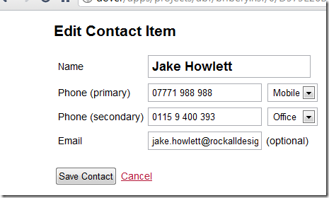
Earlier today I was knocking together a simple form for a Contact/person document and thought I'd add some visual appeal by styling the primary input box on the form:

Hopefully now, when the user is editing contacts it will be more apparent exactly what it is they're editing.
Changing the font size of individual inputs is never something that's crossed my mind till now. I think it works quite well, don't you?
To do this is, as you'd imagine, very simple. The input in the shot above has the CSS class "big". In the CSS there's then a
input.big{
  font-weight:bold;
  font-size:1.3em;
}
Simple, but effective. My favourite kind of tips.
I can see this aiding form input on mobile devices by adding and removing the .big class to inputs onFocus and onBlur. Sort of an on-demand zoom.
Reply
In my opinion it's quite annoying since the height of the fields increase and decrease, moving all content next to it up and down...
Reply
Show the rest of this thread
Jerry,
Not sure about the mobile devices. But in IE(8 and above, with doctype) and other modern browsers, a :focus pseudo-class for the input will work. No need to add/remove in onfocus/blur.
like
input:focus{
font-weight:bold;
font-size:1.3em;
}
But changing the size on focus could be annoying..
Reply
I've always tended to use a background colour (e.g. light yellow) to highlight a field currently selected.
I also use this for validation, so that when a field is exited, if the field value is invalid, it makes the background light red, or light green for a valid input.
Reply