Another Example of Bad Design
I was expecting a delivery of wine yesterday, so, when it didn't turn up, I logged in to the Virgin Wines website to see why.
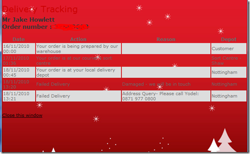
Here's the order tracking page. After a quick glance I noticed the Failed Delivery status due to an "Address Query" and a number to call.

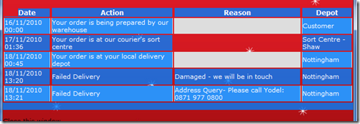
Half way through the call to that number (which was the courier - not the wine company, who I had to call separately) I noticed what I'd failed to notice on first glance - there's a row above the one with the phone number in:

Had I seen that row I wouldn't have needed to waste my time making two phone calls (or writing this blog for that matter ;-)
I'm sure it's just a seasonal background they've added, but the grey on red text is a massive usability failure. Seems nobody thought about the effect of changing the background colour...
Looks like the only thing missing is an embedded avi with a Christmas jingle and an animated divider of a reindeer. Otherwise the late 90s-looking page would be complete.
Reply
Plus your order number is covered in squirty string, how are you supposed to read that ;-)
Reply
Yeah, don't know why I did that. I get overly-paranoid sometimes about things that I don't really need to. What did I think you guys would be able to do that that number!?
Reply
Show the rest of this thread
Hi,
They Hear it Through the Grapevine ... Which browser did you use ? Perhaps, they haven't tested all.
Christmas is coming and they want to impress customers !
Perhaps it is a Domino view and an empty field does not fill the cell with a html space ;)
Reply
Wow, that is amazingly ugly. Do you think it was meant to look that way? Or built to look differently.
Reply
Holy cow... My retinas are bleeding...
Reply