CodeStore Version 7.6
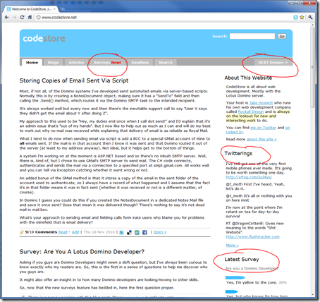
My eagle-eyed readers might have noticed a few changes being made recently on this site? Particularly on the homepage:

Notice that my recent Tweets are now in the right-hand sidebar, along with the results of the most recent survey. There's also a new tab called Surveys to host blog entries with surveys attached.
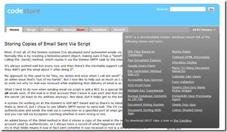
Also, I moved the "DEXT" tab over to the right to try and set it apart from the actual content of the site. Notice that hovering over it brings up a list of the noteworthy demos contained within.

There have been numerous other changes you're less likely to notice. For example:
- Links posted in to comments now get converted to working links.
- Less images used and a splattering of CSS3 applied.
- Added "social" sharing links to all blog entries to let you easily share on Delicious, Twitter etc.
Why?
They're all things that have been on my to-do list for ages and I decided it was high time I gave this site a breath of fresh air. Last thing I want to happen is for it to become dated and showing signs of age. I like to think it's always been on the cutting edge (if not the bleeding) of web trends.
What Else's To Come?
- Better search (possibly via Google Site Search?).
- More mobile-friendly.
- More content. Well, hopefully.
Stick with me.
That New is too red ;)
Reply
Don't worry, it won't be there for long.
Reply
Great work Jake!
Things like polls can really enhance the engagement (I hate that word) on your site. I have a long todo list of such improvement myself but lack the focus to do it, and am considering moving my blog to another platform one day.
I still find your new comment system to be the best recent improvement but these evolutions really are great too.
Just one reading suggestion for you:
http://www.useit.com/alertbox/mega-menus-wrong.html
If you're not familiar with that source, it's Jakob Nielsen's site. He is considered to be THE usability guru of the world. Unlike many others, all his findings are based on actual data and research. I have read some of his books and particularly "prioritizing web usability" is worth it's weight in gold. As for pulldown menus, his research shows that:
- Pulldown menus suck and confuse and irritate users
- Hovered 2D menus (mega menus) are an exception to this rule
- ...But not when they are not categorized and/or iconized
I think your mega drop down menu is fine given your audience and it is really good that you can get to the content on non-hover devices (iOS). Just wanted to give you a tip on how you can easily determine the usability of an individual element you're designing. Base it on data, not opinion.
Reply
Thanks Ferdy. For what you said and for testing the link-converter too!
I'm aware of Mr Nielsen. Also aware of the issues surrounding mega menus. Nothing's ever perfect is it.
What I don't like about my own mega menu is that all the DEXT links, in effect, navigate away from the site with no warning and could therefore be seen as unexpected behaviour. Hence why I never like the DEXT tab at all, as it's not a tab - it's merely a link.
I'll read the article though and possibly re-consider its use.
If you want to see how to really confuse users, see how I used mega menus on the three tabs at the top of this site:
http://www.hurdlow.co.uk/
Reply
Show the rest of this thread
Jake,
Getting Codestore to be mobile-friendly is for sure one of the trendiest things you could do. There's a lot of noise around mobility right now.
By the way, the changes look nice !
Reply
Agreed. It already is mobile friendly in that it *works* on all devices. I just want it to be a more natural experience per device.
Ala https://twitter.com/#!/Malarkey/status/3574419901390849
Reply
Nice work Jake - quick suggestion for the drop down menu:
Delay the closing of the menu slightly its very jumpy else if you move around the edge of it and more of a highlight when moving over those links would be good.
Reply
Jake, one more thing I forgot...it is recommended to only display a mega drop down after 0.5 sec of hover. This way you do not confuse users who hover by the option with no intention of actually going there.
Reply