Using Google Charts API With Lotus Domino
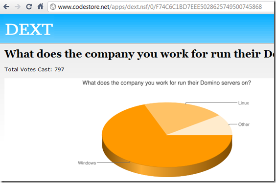
I just updated the DEXT survey demos to include a graphical image of a pie chart, rather than the amateurish bar charts created with CSS. You can see an example here:
Looks good doesn't it. Wondering how complicated it was to do? Be surprised if I said it was very, very simple?
Earlier on today I Tweeted about how much I was liking the ASP.NET's built-in Chart component for creating charts on the fly. In reply my wife's friend's husband suggested I look at the Google Chart API, which is what I've used to create the charts above.
So simple it hurts.
I won't bother with a "how to" as it's very simple and well documented on the Google Charts site I just linked to.
Obviously it's a simple way to add a chart to a page generated with any server, so why did I add Lotus Domino to this blog's title? To keep the people who voted "no" in the this survey :-)
At some point soon I'm planning on adding the surveys to this site itself. I'll use the Google charts when I do.

What would be cool is if there were a bunch of reusable XPage controls that utilizes this API and you can bind to Notes/Domino data.
Reply
Bob,
That would be great. I considered trying to do that with the Dojo charting but never have had the chance.
Reply
Dojo charting give you those capabilities also.
Reply
Without having to make a round trip to google to get your chart; however the dojo ones don't look quite as good.
Reply
Show the rest of this thread
Forgive my ignorance of all things Dojo but how does it do it? It's a JS framework, so how does it build images - does it use SVG/canvas?
Reply
Show the rest of this thread
Bruce,
True. But it is improving.
Reply
Thanks Jake, very useful
As for the relevance to Domino - well just create an xPage with an image and compute the URL for the image.
As a two-minute test my image url was grabbed from the Google wizard then split up like this:
var baseURL = "http://chart.apis.google.com/chart?" ;
var chartstyle = "chxt=x,y,r,t&chs=300x150&cht=bhs&chco=3D7930,A2C180" ;
var axis1 = "32.787,57.377,34.426,75.41" ;
var axis2 = "19.672,9.836,26.23,16.393" ;
baseURL + chartstyle + "&chd=t:" + axis1 + "|" + axis2 ;
The axis numbers could very easily be replace by @dbcolumn / @dblookup
Of course I look forward to someone building a re-useable control as discussed above, but it's pretty easy to get started now (much easier than Dojo charts).
Reply
You are the Best.
Reply
I prefer flash based charts.. Fusion charts are great , you can download most of the frequently used charts for free.
Reply
Should see High Charts - http://www.highcharts.com/ - is js based, no reliance on flash, etc.
Reply
It's a good choice but there are drawbacks :
- data security
- accesibility
I love the Google-O-Meter Charts , I don't know another tool that provides that.
Reply
Indeed. As with any tool, you have to use best judgement. For the actual app I'm working on I wouldn't use it, as it needs to be secure. For this site's surveys it's perfectly fine.
Reply
One recent update for FusionCharts that seems to be very good - is a dynamic use of HTML5 - so they work on iPhone/iPad etc without needing to build additional fallover options in.
Reply
oooh
Reply
Hi Jake,
We like them as you can get a proof of concept up and running in next to no time - without having to mess about with any third party components.
We're quite happy with how Google Charts performs, we use it heavily on some BI dashboards. We've also built a wrapper control which allows us to just pass it a chart type along with all the collections of data and the control handles building the querystring itself for the image src itself.
Combine this with jQuery and you have a fairly flexible way of creating charts and updating them asynchronously.
Like you say it's choosing the right tool for the job - but not a bad path to go down all the same.
Mitul
(wife's friend's husband :)
Reply
Jake,
Dojo using SVG. It is not as good as the Google Chart yet, but it is getting better.
Reply