Nice Button Images - Another Simple Fireworks Example
Seeing as though a couple of you liked yesterday's simple Fireworks demo, here's another one. This time I'm going to show how easy it is to create nice-looking "buttons".
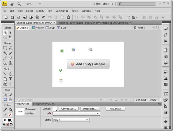
Here's an example of the kind of button I mean:

I normally use them in places where what the user is seeing is nothing more than an <a> link, but I want it to look more like an action. Although I could just use an <input>-type button for this and a GET request form, I prefer this approach, as it looks nice and you always know the "button" is going to look exactly the same to all users.
Creating The Button
Right, let's create one. Start Fireworks first (get a demo if you don't have it). Then, using the Shapes tool, select Rounded Rectangle and draw something roughly button-shaped, as below:
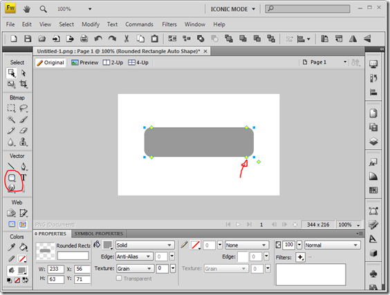
Now click the yellow square pointed to above and drag it to the right to reduce the radius of the button's corners to make it a bit more subtle.
Then using the Properties pane give the box a grey 1px Hard Rounded border and a Linear Gradient fill, using the areas highlighted below:
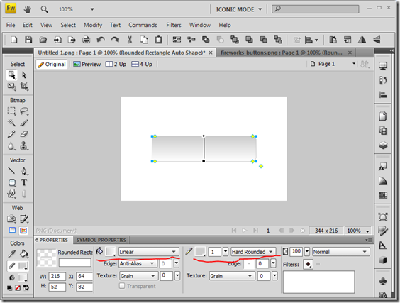
Now change the two colours of the fill to a light grey and white. You'll have to work that one out for yourselves, but it's easy enough done - just click the colour-picker next to the Fill bucket icon and you'll see.
To make it look like a button we want to flip the gradient. To do this use the square end of the gradient line to rotate it just over 180 degrees and then use the round end to move over to the left a bit. You'll end up with something more like the image below:
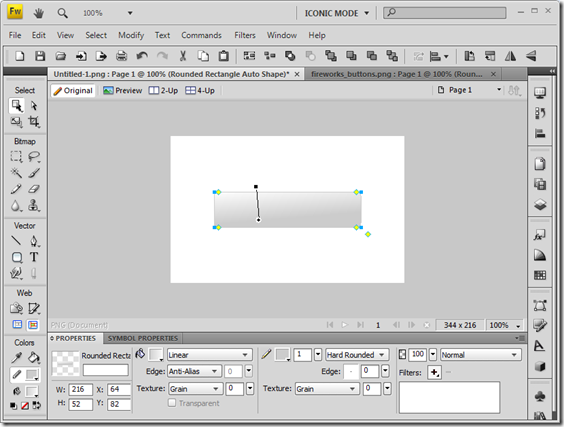
Starting to look a bit like a button now, no?
Now let's add an icon. To do this I'd suggest downloading and extracting the FamFamFam Silk icons to a folder. Then open the folder in Windows Explorer, like below, and you can then drag drop as many icons as you like directly to the canvas area.
I tend to keep a selection of commonly-used icons on there and then only move them to the button rectangle when needed.
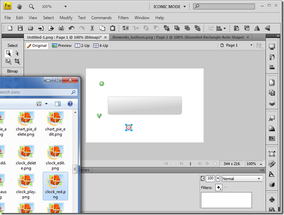
All we need to do then is move an icon to the button and add some text. Et voila, a button.
As a finishing touch, why not add a very subtle drop shadow?
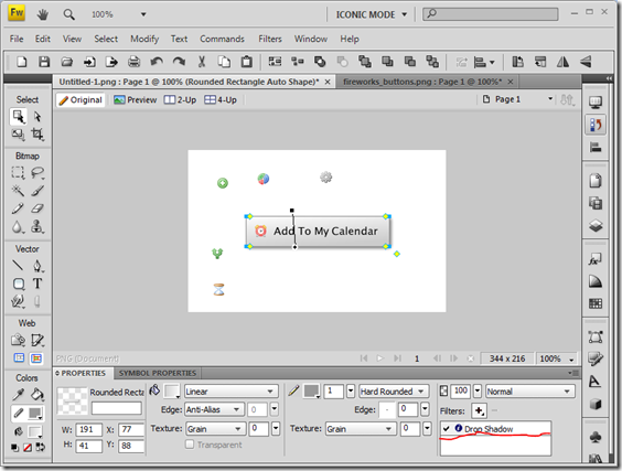
Pretty cool, no? Takes about 2 minutes.
What you end up with is a Fireworks PNG file you can use across multiple projects. What I normally do is add the rectangle to a locked layer. Then you can simply move icons around and change the text as and when you need a new button. All you need to add is a Web Slice to cover the rectangle area for export.
Use Cases
I use these kinds of buttons all over the place. As an example, take the button used to reply to comments on this site, which looks like this:
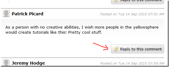
In the above example the graphic rectangle shape is actually just a background image to the link and the text you see is real selectable, which makes it a bit more accessible.
Another example is the voting button on the DEXT survey demo.

In this case the image actually is a button. The HTML for it looks something like this:
<input type="image" src="images/buttons/vote.gif" onclick="doAjaxVote(this.form); return false;" value="Add My Vote">
This is accessible by virtue of it being inside a <form> tag. If the JavaScript fails then the Form submits regardless.
More often than not though I use the images like this:
<a href="memo?OpenForm" title="Compose Mail"><img alt="button" src="images/buttons/new_mail.png" /></a>
There's perhaps an argument against re-styling what the user might expect a button to look like, but I think if you use this approach sensibly and in the right places it can work quite well.
Here's the fully-editable Fireworks PNG File with a few common icons in it.

If you right click and save it you can then open and edit it in Fireworks!
You really can't go wrong with the FamFamFam icon set. I have them all stored as resource images (both in .png and .gif format) in my master template and drag them in as necessary. Why .gif? Well I can then use them directly in columns in my Notes apps. PNG formats didn't behave nicely in earlier versions of Notes.
I still use Photoshop. Errrm. Except I am still using version 4. None of this CS stuff. Yes, thats how old my version is. But I might give Fireworks a try since you've somewhat inspired me.
Reply
one addition: when you can guarantee that the users are using modern browsers, you can completely skip creating the button as an image, and make a standard HTML button which you can style with CSS with the gradient, round edges and even the shadow.
Reply
On the Net you cannot guarantee any such thing. Intranets are different though. Easier to go for the safe option of graphic buttons.
Reply
Show the rest of this thread
Nice article. I create my buttons in a similar way, only a majority of the time I don't add the gradient coloring. It does make a huge difference in looks though.
Reply
:) :) :) :)
Reply
Nice job, Jake! I might just have to break out my ancient version of Fireworks...
Reply
I really don't like to generate graphical buttons. Yes it looks nice, but I try to build all my applications so they can be customized through a web interface.
Now a nice button graphic with no text where I can lay the text on top dynamically would work ... but I've never taken the time to to try that out.
Reply
Depends what mood I'm in and who the site's target audience is as to whether I actually use them or not. Although i said above I "use them all over the place" I do so sparingly.
>a nice button graphic with no text where I can
>lay the text on top dynamically would work"
That's what the "reply to this comment" button on here does. View source to see how.
Also, by coincidence, the download button on the Fireworks demo pages linked to above does a nice example of styling a button.
Reply