Simple Example Of How Useful Adobe Fireworks Can Be
Why do so many people use Photoshop for web design? I've never got the big deal. I can see it's great software, but for web design, really? Is it any better than Fireworks?
In the past I've been sent PSD files by design agencies, from which I've had to then create a website. Slicing and exporting images is easy enough, but as soon as I need to make a tweak I'm completely lost and find it completely counter-intuitive - almost impossible - to use.
On the other hand when I'm sent a Fireworks file it's a doddle. Fireworks is completely intuitive. That's one of the reasons I've stuck with using the same graphic designer for so long - not only is he good at what he does, but he does it in Fireworks, which makes my life simpler, as I don't need to go back to him for any minor changes.
Me, The Graphic Designer
With Fireworks I can play at being the graphic designer.
Case in point - I just worked on a website for a self-catering holiday let. The availability calendar needed to highlight cases where it was not available for booking, but the owner's other property was. And vice versa on the calendar for the other site. They both needed to cross-sell each other.
The idea I came up with was to have the corner of a cell in the calendar's table appear folded back to reveal the alternate availability. Here's an example:
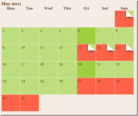
From the above you should be able to work out that all the green days are available to book. Those in solid red aren't and those that are red with a folded corner aren't available but are at the other property.
The folded corner acts as a link and takes the user to the other property's website. It has a Title attribute on the link to display a tooltip to explain this.
The concept works for me, as I thought of it and so I don't question it. Does it work though - what do you think?
Producing The Graphic
Here's how I created the folded corner image. Hopefully it will prove just how simple Fireworks makes something like this. The fact I can do it is proof enough, as I'm not graphic designer, yet I can easily turn an idea I had in to an actual image.
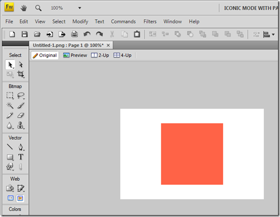
First thing I did was launch Fireworks and draw a square in the "booked red" colour. To draw a square use the Rectangle tool and hold down shift as you draw it to make the sides equally-shaped (a square, derr).
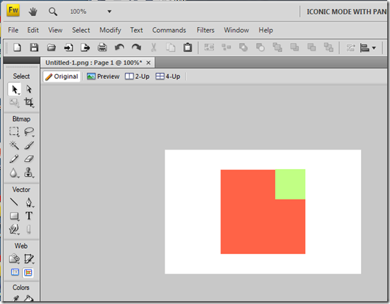
Then I drew another square in the top right corner and made it the "available green" colour.
Next I chopped the smaller square in to two pieces using the Knife tool and slicing it in the direction shown.
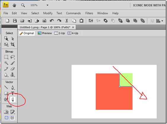
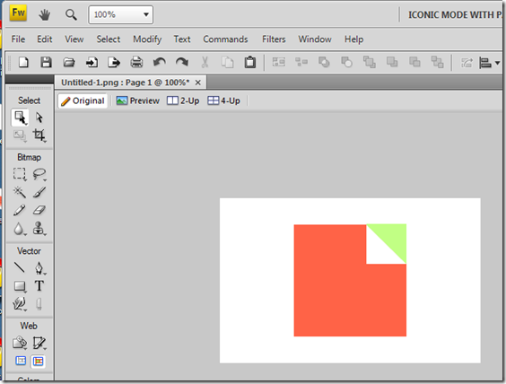
This left me with two triangles and I changed the fill colour of one to white, which produced a very primitive folded corner.
To make it look a little bit more professional I then used the Pen tool to change the shape of the folder corner to look more natural, as below.
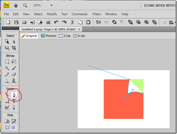
To use the Pen tool I selected the white corner, chose the Pen tool from the pallette (highlighted above) and then click-dragged the lower left corner of the triangle. This changed the two straight sides in to "freeform" shapes, which I could make any shape I liked by dragging the lines you see around. To finish using the Pen tool I double-clicked the top corner of the triangle to close it off.
As one final step I then added a drop shadow to the folder corner using the Filters area of the Properties pane, as highlighted below.
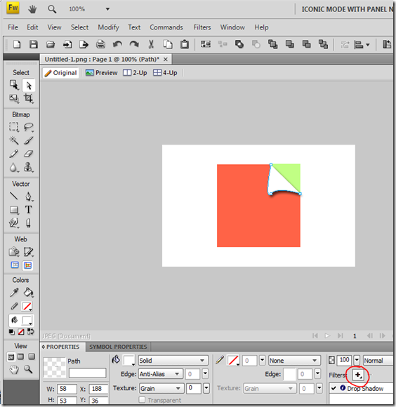
And there you have it. All I had to do then was export the image using a Web Slice and job done!
Fireworks is one of my essential tools and has been for years. Once you get to know each of the tools available you can quickly apply them all to come up with things like the above.
I wouldn't even know where to start if I needed to do this in Photoshop....
That's very impressive actually. I wouldn't have even bothered starting to create an image like that myself but now I've seen you do that, I might give it a try some time.
In terms of usability and your choice of graphic at first glance I think I might take that to mean "provisionally booked" or something rather than anything like an alternative. But I guess if your tooltip explains, it it would become clear.
Reply
Forgot to mention there's also a key at the top of the calendar page which explains all. There's two shades of red too - one for booked and one for provisional:
http://www.peakmermaid.co.uk/calendar
Reply
Great idea. I still use Fireworks too, CS3 at the moment. I am hesitant to upgrade to the current release. The only thing I miss is that I often get CMYK color schemes from printed material but Fireworks prefers RGB (Hex) values. I also sometimes have problems with complicated psd files. Maybe this is better in newer versions.
I originally thought that Adobe would kill Fireworks and although new releases do not contain a lot of new stuff it at least moves forward.
I still would like to use a product that is really pushed forward and not in danger of being photoshopped. So far everything I tried failed (including Photoshop itself).
It seems I will keep it until Adobe pulls the plug.
Reply
I'm with CS4 now and only updated to that as a file my designer sent me used "Pages" which I needed CS4 to open. Otherwise I'd have been happy to stick with an older version. Like you say, there's never much added in newer versions. Even if Adobe killed it off I'd keep on using it (at least as long as my designer did anyway).
Reply
As a person with no creative abilities, I wish more people in the yellowsphere would create tutorials like this! Pretty cool stuff.
Reply
Absolutely agree Jake ... I do all my design work in Fireworks ... i used it first to "low-fidelity prototype" (albeit higher than something like balsamic) an app's UI, then work through to as pixel perfect a design as I can get to, and constantly go back to the source for rework/inspiration. The fireworks PNG becomes the applications "brand guide" almost, allowing me to set colors, font styles, etc. It should be in every developers back pocket.
Reply
Nice! The ability to manipulate primitives is pretty key to good image design in terms of being able to respond to revision requests quickly. Traditional freehand just can't keep up.
Thanks for the tutorial - like Richard, this is encouragement enough for me to try it sometime if I get a chance to use the tool again. I have a license for CS3 but never had strong enough demand to use it or cart it from job to job (one of the gotchas with consulting out of house all the time, Jake, you have to use THEIR kit and their build.)
I've gotten away with using Paint.NET (free) as it has good file format support for graphics files but does not keep a concept of a primitive once you create a shape. On Linux, Inkscape (f-ree-hee) has come a long way and does have the ability to manipulate primitives but importing anything specialized like a FW or PS file isn't possible. You drop to png and then import, leaving you to do a lot of editing rather than manipulating what's there.
Reply
Having used Photoshop since version 5.5 (1997-8??) I guess I've not really looked into Fireworks even though it's now installed with my CS3 Web Premium applications. Photoshop has always been the "go to" tool for me. It did have a long learning curve until I felt competent with it. When I did take a quick look at Fireworks I guess I expected things to work more like Photoshop and never really got the "hang" of it so gave up since I could do everything in Photoshop...
The other thing I use Photoshop for are photos and photo correction especially since I can shoot in digital negative format and play with a photo to make it look the way I want. I just got the install CD today for CS5 Web Premium and am looking forward to exploring the new features!
Guess it all boils down to using whatever tool is most comfortable and helps you get the job done...
Reply
I use Inkscape for vector work and Gimp for pixel editing ... both free. Perhaps not ideal but I get by with them.
I'm also looking at Blender to build 3D objects that are then rendered to 2D with shadows and such for fancy logs. Overkill for most things and a steep learning curve, but interesting and fun to play with.
Reply
One reason I always liked Fireworks over Photoshop is the sprite technology that made images with multiple pieces of information much smaller in size than Photoshop. The reason is that, at least in earlier versions of Photoshop, any time you wanted to add a small element, it still added a full layer.
I do not know if Adobe brought any of this technology into the latest and greatest version of Photoshop or not after they aquired Macromedia.
Fireworks also always did a better job at compressing images for the web.
All that being said, for high-end, detailed graphics work, Photoshop still rules as the industry standard,
Have you used GIMP at all?
Reply
Great article! I like seeing how others work graphics. I'm far from a designer but I enjoy working with images.
I prefer Fireworks also. I've tried Photoshop a few times but on my own. Perhaps with a little training it would be okay but for what I do Fireworks always been sufficient. There just seems to be too many ways to do things.
Reply
As I thought about this, it is actually much easier in Photoshop. I just add the layer and peel it back...
Reply
How do you "peel it back" in a 2D program with no concept of objects. In order to get the "peel back" effect you'll have to do a lot of pixel editing to get the 2D edge and the shadow cast.
Or is there something new in the latest Photoshop that does this? On researching this I found this article that shows how to do it in CS2. So it isn't even new.
http://photoshoptutorials.org/photoshop-tutorials/easy-page-curl-in-photoshop-cs2.html
So I guess it can be done and isn't too hard after all. I never used the warp function in Photoshop.
Reply