Probably the Worst CAPTCHA Ever Made
This weekend we stayed in an "aparthotel" for the second time in as many months. Until we booked the first stay I'd never heard of them. They're city-based apartments for rent by the night, much like a hotel, with a reception etc. The difference is you get two bedrooms and a separate living room/kitchen. The kitchen has a cooker, microwave and dishwasher.
If you have to take a family of five away with you (we were at a wedding in Newcastle) then having separate rooms makes it bearable, whereas doing the same in a conventional hotel is nothing short of a nightmare. From now on I don't think I'll stay anywhere else with the kids. We got the double room apartment on Friday for £120, so not that much more than a basic room in a city centre hotel.
Anyway, I mention it for two reasons. First to hopefully enlighten you guys. I guess you all knew about them, but if not, they're worth looking in to next time you're away with family or friends. The other reason is that I just had to pass on an example of terrible UI design from the website of the one we stayed in on Friday night, Kensington House.
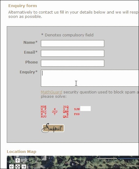
Looking for a map I looked at their contact page and saw this. See if you can see anything odd:

It took me a while to work out that the weird "garbage" in the contact form was in fact a CAPTCHA. Can you see it? If you pull your head back and squint you can just about make out that it says 8+9=. The white box to the right of it must be an input field.
It sticks out like a saw thumb. No less so because the site itself and the place it represents is going for the "swanky" look. This is what happens when you let a geek design part of the UI. I can imagine he feels fairly smug at having written such a clever spam blocker, but what about the poor user?!
I've said before and I'll say again - in my opinion spam is not the user's problem and so they should not be the one made to pay. That's why all spam blocking measures on this site are back-end. Not making the user pay is all the more important if the contact form is on a company website. If you run a company surely you want to make it as easy as possible for potential customers to make contact. Why make them jump through hoops!?
The other reason for this post is because it's Monday morning after the break and I need to ease myself back in to office work nice and slow.
What a lovely site, aside from the captcha (and I'd have to agree, it's awful.) The developer must've convinced them that it was a necessary evil. Maybe the developer designed it himself, so he thought it was "cool". There's really no other explanation for such a bad addition to an otherwise very nice looking site.
I reckon the site would have been designed and launched, only to be bombarded with spam at some point soon after. At this point the CAPTCHA was probably added as an afterthought - possibly without the original designer's involvement.
It was designed by a development company so Jake you're probably right about the original developer not being the one that modified it. Surely there were more than one person to look at it that could have made another suggestion!
But it's funny how that the developer's site doesn't come up. :)
I think I can help Jake, the answer to the captcha is 17. Hope this helps.
OK site, but what's with the horrible background?
Also there appears to be a blob of grease or oil, or a teardrop maybe dripping down the right hand side of the navigator.
Maybe it's just me, but I thought the captcha was OK...Better than the blogger.com captcha's, where the text is all curly and you can't tell the difference between an l and a 1 and an I.
I've indeed heard of 'aparthotels', and like hotels, some are great and some not. If you find yourself in Paris and need somewhere like this, this place is good -> http://www.wotif.com/hotel/View?hotel=W19599&page=1&viewType=all
We had a 2 bedroom one that fitted 6 adults and a child cos the living room had a comfy fold out bed.
Anyway, happy new year to you, your family and codestore.
@Nick - I agree
I think the navigator is supposed to look like blinds and the teardrop thing is the drawstring.. If the drawstring thing was gone it would look a lot better, in my opinion. I also don't like how the background image fades to gray at the bottom of the screen. Those two things just kind of strikes me as odd.
I think that the CAPTCHA is definitely one of the ugliest I have seen, but maybe not the worst.
;)
Hi Jake,
The captcha code is an php script from here http://www.codegravity.com/projects/mathguard
Apart from it's looks I don't think it would very difficult to crack in code, the random characters it uses are pointless as it the shape of the number that would be recognised...
Look at http://random.irb.hr/signup.php - it just has to be the coolest captcha ever.